

We spend our entire lives following rules. Drive on the right. Stop at traffics lights. Don’t punch your sister. It’s exhausting. So, why in the world would you spend your free time reading about more rules when your head is already buzzing with them?
Well, these rules will actually help to make your life a little bit easier. It wil definitely help you design better. They’re the simple guidelines you can follow each and every time you start a new design to lay down a solid foundation, on which you can build whatever castle you want.
Elements
Some tips regarding the placement and shape of elements in your web design.
Design every element with purpose
As a web designer, you’re creating digital tools. Tools which people will use every day. Therefore, it’s important to work with intention and think about the elements which make it into your final designs. You don’t see many hammers or screwdrivers with a lot of unnecessary extras, right? So why would you clutter your design with needless thingamajigs and doodads.
Some might read this as: needlessly complicate your design process by overthinking every little detail, but that’s not what I mean. Sure, this process might start out with some more work, but that’ll only help the process down the line. When you design with purpose, know what you’re doing and why you’re doing it, you won’t have a client knocking down your doors with a Bible’s worth of feedback. It’s a timesaver, really.
Align every object to at least one other object
It’s impossible to align every object to everything else. Not aligning an object to at least one other element, however? That’s pure lunacy. We’re web designers, not mad men. We are trying to build the best products possible and aligning objects helps you create clarity and order. It helps people make sense of your design easier. A great rule of thumb is to start simple: align every object to at least one other object.
Place all objects at a logical distance from each other
This rule will make your life easier as well as your designs better. If you place two buttons 8px apart, don't place them 75px away from another element. Always measure your distances in multiples of the smalles increment in your design, so in this example multiply by 8px to get 64px or 72px.
This way, everything in your design has an underlying structure that the user may not see, but that will certainly stand out.
Place elements in order of their visual weight
Elements have visual weight. A fully coloured block feels heavier than a block with just a line around it. Place these elements in the order of the weight, with the heaviest one coming first. You wouldn’t put steel on top of glass, so don’t turn this around either.
For odd shapes, use optical alignment
Automatically aligning odd shapes almost never works properly; the visual center of gravity of such elements is not in the center. If you have your computer center an odd-shaped element, you’ll see it doesn’t feel like it is actually properly centered. Always center odd shapes by eye.
Always use 12 columns for a horizontal grid
Have you ever considered a different way to tie your shoes? No, why would you? You've been doing it the same way all your life because it's the best way. Likewise, thousands of designers have tried hundreds of different options for horizontal grids. The result? 12 columns are the best option. Don't hesitate and make it easy on yourself for once - I allow it!
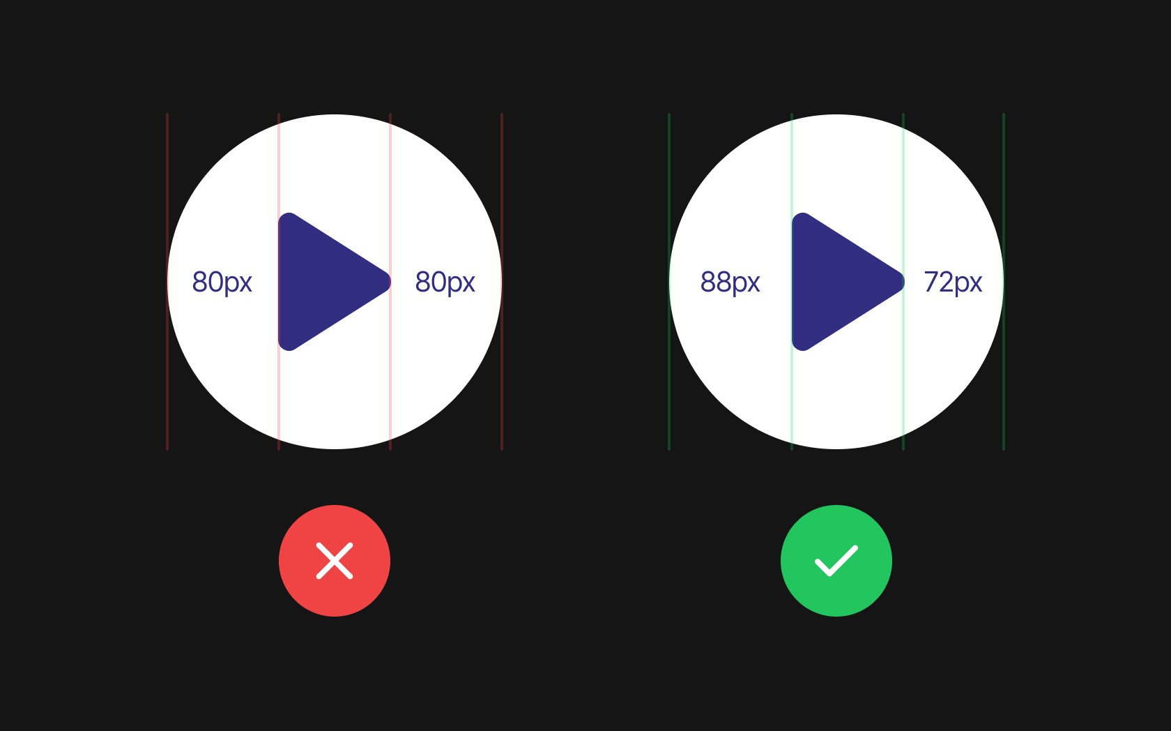
Make the padding larger on the outside than on the inside of an element
While most of the rules on this list were created in the last twenty years, this rule is thousands of years old. Even the monks who copied Bibles by hand every day already knew that you had to give the columns on a page more distance from the edge of the page than from each other. It just works, just ask the monks.
Make the padding on the side of buttons twice as large as the top and bottom
What do you click more often: digital or real buttons? Just think about that. We spend so much time on the internet that digital buttons probably win. That is why buttons have now found their best form, a little like Charmander, that evolves into Charizard. In the same way, why reinvent the wheel if we know what clicks?
Match the rounded corners of blocks
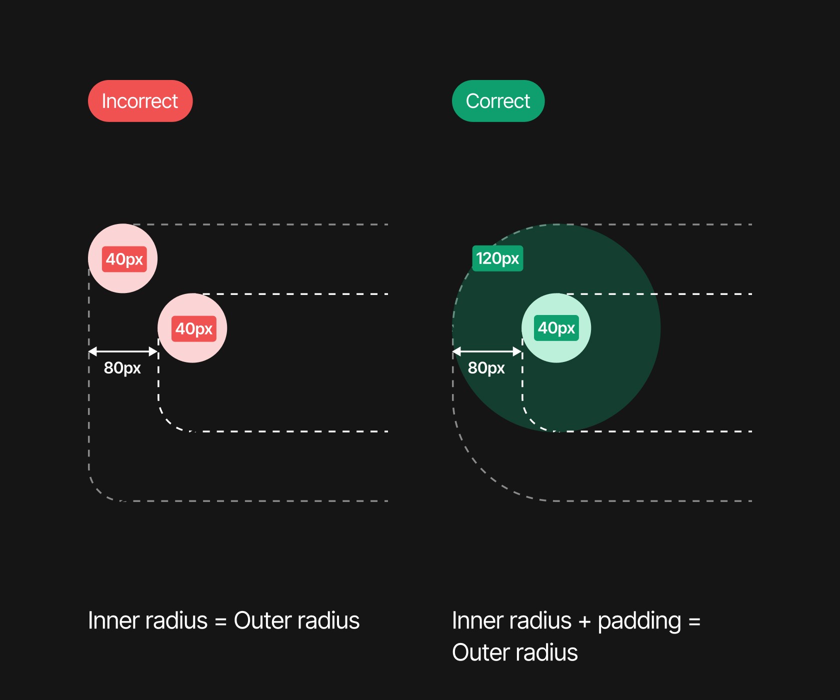
If you have two blocks with the one inside the other and they both have rounded corners, use the distance between the corners to determine how many pixels the inner element should be rounded.
If the inner block has rounded corners of 40px and the outer element is 80px away from it, then the rounded corner of the larger element should be 120px. If you do this, everything is ok in this world. If not, I'll come find you.
Color
Rules about use of color in web design.
Ensure high contrast in key elements
Without contrast, all your content sinks into a field of mediocrity. Make sure your design speaks by distinguishing important elements with high contrast. Our eyes are naturally accustomed to distinguishing high contrast; clear dividing lines help us understand the world (and your website) faster.
Never use two hard dividers in a row
A dividing line in your design is like turning a page in a book. Two dividing lines close together are like a book with a full page of information that you turn only to find an empty page, after which you have to turn another page. It's strange and throws your design out of balance; better to be avoided.
Use a light-saturated shade of your color for white space
Do you want a simple way to get more unity in your design? Just think about how you dress yourself: if the color of your shirt is also reflected in your socks, your outfit will feel more complete. If you replace white in your design with a light-saturated shade of your main color, you'll get the same effect. While many users may not even be able to pinpoint it, your website will feel more cohesive.
Never use both warm and cold colors as light-saturated shades
Your color palette may contain both warm and cold colors. It's your color palette, so do what you want! In that case, make sure that you do not use a slightly saturated shade of both colors in your design and choose a main color: warm or cold? If you use both, a fairy godmother dies. Beware.
Use a color palette with different brightness values
When all the colors in your design have the same brightness value, it is more difficult to make something stand out. Clarity in particular can demand your user's attention. When working with the color palette, make sure there is a difference in the brightness values. You can easily do this by using HSB color codes, because they use 'brightness' as a value.
For the border of an element, use a color that also contrasts with the background
The purpose of placing an element in the background is to create visual hierarchy. You guide your user's eyes through the content and want to do that as best as possible. By making the edges around your elements contrast with both the element and the background, you create more 'distance' between the two.
Lighten key elements
Although elements on your screen do not have to comply with the laws of nature, this often works best in web design. In real life, elements that are further away from a light source become darker. Therefore, if you want to create the feeling of depth with different elements, make sure that everything that is 'closer' to your user is lighter.
Make the blur of a drop shadow twice as large as the distance
The same principle as the previous point applies here: just do what nature does. Although you can play with the drop shadow buttons until the cows come home, there is a simple best practice: make the amount of blur twice the amount of the distance. This gives the most natural effect and is pleasant to the eye.
Fonts
Tips for all your texts.
Reduce letter spacing and line height for large text
Here is an age-old tip from the beautiful art of typography. If you use large text on your website, reduce the letter spacing and line height. The little bit of space between the lines at 16px is like the Grand Canyon at 72px. Here too, try to keep distances logical.
Always make the body text larger than 16px
No one reads small lines of text. Not on a contract and not on your website. Online, text is only readable from 16px and up, so never dip below that. Also, don't blindly make all your texts 16px from now on, because every font is different. Some fonts are only usable way above 16px, so see what works for your website, font and audience.
Use a line length of approximately 70 characters
Using line lengths which are too long is like being forced to listen to that one uncle at a party who likes to talk about his mortgages. After a while you just lose track about the content. Ensure that your audience can read the text on your website by maintaining line lengths of a maximum of about 70 characters.
Use a maximum of two fonts
There are so many fonts, why would you limit yourself to just two? Heck, each element can just as easily get its own font! I mean, you do you, but don't complain if people don't stay on your website for even half a second. Users like websites with a maximum of two fonts, that's just how it is. Take your art to a canvas, keep your website for usability.


